but I just wanted to say it again seeing as it's on the front page of STW right now, I hate the 2012 logo, it looks like Lisa Simpson giving someone a blowie. Or is that just my dirty mind? It's awful 🙁
Can't see it myself but I'm tired and dirty minded out today 🙁
[img] 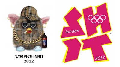 [/img]
Yeah it looks like lisas sucking Bart
What's happened to those one eyed monsters who are the mascots? Are they still going or have they been dumped?
Personally I just see:
SH
IT
But that's maybe cause I dirtied my pants today 🙁
Really - the logo is truly awful.
maybe this will help admiralable...
[img]  [/img]
I cannot see it without thinking its Lisa Simpson giving someone fun times....never thought it was Bart though.
ha, I love Geoffs version. Much better and Phil's does make it clearer what is actually going on. It is hideous. The mascots are even worse and seem to have disappeared from existence.... says it all really. I think technically they are still around though
Just shown the logo to MrFC on Google images. He's never seen it before.
I asked him what it reminded him of. He said..."looks like someone's giving someone a blow-job"!!!!!!!!!!!
Oh dear... 8)
hahahahaha, so it's not just me then!
The logo isn't spectacular but the brand is great - vibrant, fresh, unique and definitely not a typical Olympic identity.
Don't really see the blowjob on the original but definitely spells S H I T
Ha ha! Look at that funny little Burberry thing with White Lightning and everything! Brilliant!
The Whole Lympic branding exercise has been a ****ing joke. Those responsible should be locked up in the Tower. Cost millions no doubt; I could've done a better job on my own. And I don't say that with any arrogance. The official logo and branding is piss-poor, the whole lot of it.
The logo isn't spectacular but the brand is great - vibrant, fresh, unique and definitely not a typical Olympic identity.
Eh? Åre you serious? It's shite!
Just about every single person I've spoken to thinks it's shit. You'd have to have absolutely no taste or sense of aesthetics to think it's actually good!
I'd prefer that funny little Burberry thing though! What is it?
That little furry thing Elfinsafety is called a Furby. Created by the devil to watch human mortals. My brother used to collect them when he was little. He had 61 at one point, every single one of them different and all of them possessed little demon creatures. They talk and will respond to one another if put opposite or close enough for sound recognition which was their selling point. Try being in bed asleep one night and having them all in the cupboard in the hallway, one malfunctions as its batteries are dying, sets off ALL of the F**CKING things. I have never been so freaked out in my life. Good thing was it scared the living sheet outta my brother so they all had to go 🙂
61 of these F**CKING things in the middle of the night. Not that I'm still disturbed or anything:
Well now what a truly bizarre thing. 😯
61 of these F**CKING things in the middle of the night. Not that I'm still disturbed or anything:
Jeeze, I'm disturbed just seeing that vid of three of them. Spehsly the one in the middle. Sits there just staring at you, then all of a sudden goes mad.
Do they do a Burberry Furby (!) then? I want one...
Eh? Åre you serious? It's shite!
Just about every single person I've spoken to thinks it's shit. You'd have to have absolutely no taste or sense of aesthetics to think it's actually good!
Yes I am being serious. and read what I said - I said the BRAND is good, not the logo specifically.
eBay i suspect. There is bound to be one, there are elvis ones stuff like that. Just don't feed them after midnight and keep them away from cats, cats get very upset around them.
Yes I am being serious. and read what I said - I said the BRAND is good, not the logo specifically.
Mate, I live in an area where that 'brand' is plastered all over everything; posters, hoardings, buses, stuff in supermarkets, even in places like hospitals ffs. It's nasty. Virtually no-one round here likes it, and we're the ones who have to see it every bloody day, remind us how much money is being wasted on a flippin' circus while local services are being slashed.
It's shite branding; it evokes nothing of London, the Lympics, people, celebration- nothing. None of the meaning it should convey.
Look at these logos from previous Lympics. Granted, not all are fantastic, but loads better than ours. They all evoke the place or culture of where they were held, maybe Atlanta's one is a little weak. But Barçelona's is great (Juan Miro design), as is Seoul's, and Sydney's has a little boomerang!
[img]  [/img]
What does London's 'brand' say about London? Absolutely bugger all. It's not even in the right kind of colours, ffs. You'd think, with London having one of the most globally recognisable bits of graphic design around, the Underground map, not to mention so many iconic landmarks, that they could perhaps have come up with something decent, but oh no. We get Lisa Simpson giving a blow-job. 🙄
I mean, last time I was in Barçelona, in 2006, there were places selling commemorative Lympic stuff. 14 years after the event. That's how proud they are of their Lympics. Who in their right mind is going to want a London 2012 tea set or special edition lingerie, with that abomination upon it? No-one!
Check out thse logos for candidate cities for 2016. Notice how they all involve some aspect of each place. Well, sort of. Dunno what Prague's one is all about. But they're all far nicer than London's.
[img]  [/img]
Particularly love Chicago's, the first one that is. Beautiful. That one is Elfinapproved, for sure.
[img] ![]() [/img]
[/img]
And look; Beijing even had Furbies!!!
[img]  [/img]
I hadn't seen the logo before but crikey... 😯
It seems to be an example of trying to find something 'new' for the sake of it. The Olympics just seem to a battle about who can spend the most & out do the previous one. The sporting aspect seems to be a secondary consideration now 🙁
Okay Fred so you show me more logos and what did I say about the logo? Go and look at some of the branding and report back please.
Nice post Elfin, but since London has jumped the shark all those logos for 2016 applicants have now a new creative aspect to them. In comparison the pre 2012 logos are [i]all the same![/i]
Agreed that the 2010 logo is awful and has no stylistic or artisitc merit (in its static format). 🙁
only someone who is into branding and logos and similar marketing bollox would think the London Olympic stuff any good - to the general public its just utter shite.
MF - it really is rubbish to anyone outside of the ****fest that is marketing
I see the 'brand' every flipping day mate! Do you?
The garish colours are flippin' everywhere round here. The 'brand' does not convey anything about London, the Lympics, nothing. I've presented my case quite clearly above.
It's quite simply the worst logo and 'brand' in Lympic history. When they fist unveiled it, I genuinely thought it was a joke. As did most other people. Then, following universal condemnation of it, I really thought it would be scrapped, and a new one done. But no! They kept it!!!! FFS!
So come one then; explain why you think it's such a good 'brand', then.
Mastiles Fanylion to the stand, please.
Reminds me of the opneing credits to some awful 80's tv show!
[img]  [/img]
And Fred - have you seen the glaring omission from every 2016 'Applicant' logo? It does afford them greater creative flexibility...
I'm not really clear what the difference is between branding and logo is, all I see is a cack logo. It would be really good MF if you could post a link to an example of the great branding, so I know what I'm meant to be looking for.
have you seen the glaring omission from every 2016 'Applicant' logo?
Go on then, what is it?
I admit, I haven't been to art college and done a degree in design, I just work on what I know will have appeal to clients and the public. I admit I have loads to learn. But I know enough to know when something is shite.
MF; don't try being all clever, come on, explain why it's such a good brand. Come on!
MF - it really is rubbish to anyone outside of the ****fest that is marketing
😆 It's true though!
what TJ said when people in the occupational area like it and the general public does not then you really are not serving your market but your peers.
Less politely it is cr@p
Fred - I said why above.
What is missing? The Olympic rings...
(which, of course means the final logo will be different from the 'applicant' one. Just like the London one was.
Well I took that as a given that the rings would be added to any logo, in some way, but yes, point taken. I think it's better to present the unique brand of the applicant independent of the Lympic brand, tbh.
But you still haven't presented the case for the London Lympic brand, have you?
the brand is great - vibrant, fresh, unique and definitely not a typical Olympic identity.
Not good enough. Why is it 'vibrant, fresh and unique'?
The jury are getting restless. IanMunro requires clarification of the meaning of the term 'brand'.
Ian - the logo is the 2012 bit, which is a component part of the brand which is everything else used to Market the games - posters, websites, TV graphics, leaflets, programmes, brochures etc.
The official site is a good place to see a small part of the brand in application.
Fred - I said why above...
And why is what I said 'not enough'? What is 'enough'?
i don't think it's a bad design because of its abstract nature which let's be fair, is the usual daily wail type reaction to it. it's a bad design because it says nothing about the city of london and even the 5 rings are almost secondary compared to the primary coloured rings in previous logos so it doesn't say much about the games either.
it's kak.
[b]you still haven't presented the case for the London Lympic brand, have you?[/b]the brand is great - vibrant, fresh, unique and definitely not a typical Olympic identity.
Not good enough.[b] Why is it 'vibrant, fresh and unique'?[/b]
You are good at answering questions with questions M_F
And why is what I said 'not enough'? What is 'enough'?
Most people think it's crap. Mainly because it is. My mum thinks it's 'bloody awful'. And is annoyed because she has to see it everywhere. Many foreigners I've spoken to about it think it's crap (speshly the Spains). Very very few people defend it. The overall consensus is that it's shite. Basically, the branding is a failure. This will definitely have an impact on merchandising and extra revenues. And the image of London (the whole reason why 'we' wanted the ****ing games in the first place was to improve London's image). I wish it were Paris that had to deal with the embarrassment.
So, unless you can present a compelling case why the London Lympic Brand isn't shite, then I'm afraid I will have no option but to declare it officially shite. Which it is anyway, but seeing as you're entitled to your day in court, then please, go ahead.
Bear in mind that Traitor's Gate could still be utilised....
I am not trying to tell anyone to like it though, I am merely stating why I like it.
[url= http://www.underconsideration.com/brandnew/archives/follow-up_uefa_euro2012.php ]Here, have a look at this article on the branding for the Football Euro Championships in 2012, to seehow a branding exercise can be done a bit better.[/url]
[img]  [/img]
You are good at answering questions with questions M_F
Well no, I was merely reminding Fred I had already answered his question.
the brand is great
then:
I am not trying to tell anyone to like it though, I am merely stating why I like it.
A climbdown??? An admission, perhaps, that Elfin is [i]right[/i]?
M'Lud, I rest my case....
An admission, perhaps, that Elfin is right?
M_F IME it is easier to agree with the angry Hobbit than continue to debate 😉
I dont think that is what he really said now is it.
The branding is crap because unfortunately the logo is so crap that people connect it directly to all the non-logo branding though you could argue that it's good from the pov that people see it and think of 2012 except that the logo has made that counterproductive. It's a classic case of marketing being done for the approval of the stupid section of the marketing industry who forget what the purpose of their job actually is and who no doubt slag off normal people for 'not getting it'
Yes you are correct Fred - I really must get my sense of opinion fixed.
It's not just me, MF; it's the vast majority of people [i]Worldwide[/i]. There are children in Polynesian islands who wake up crying because the London Lympics branding is so bad. 🙁
It's a classic case of marketing being done for the approval of the stupid section of the marketing industry who forget what the purpose of their job actually is and who no doubt slag off normal people for 'not getting it'
This, to me, sums up the root of the problem. I've no doubt bribes were paid so that this branding could be used. There's all sorts of subterfuge and dodgy dealing with the Lympics anyway.
It's a shame. We could at least have had a nice logo and brand, some nice commemorative tea-towls, fridge magnets and that, take out minds off what an unmitigated financial disaster the games were, but no. We're left with nothing. 😥
'Lasting Legacy' my arse. Lord Coe will be the first to have 3 tides wash over him, once I'm in charge....
